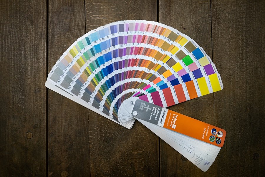
Choosing paint colors for your home can feel simple until the samples hit the wall. A shade that looks soft in the store can turn too bright in afternoon light, too dull under bulbs, or mismatched beside your furniture. The best approach is to choose paint by room function, lighting, undertone, finish, and the mood you want to create.
This guide walks you through a practical way to pick colors that look good in real rooms, not just on a tiny card. You will learn how color psychology works, how lighting changes paint, how to match existing decor, how to test samples, and how to choose the right finish for each space.
Quick Answer
To choose paint colors for your home, start with the mood you want in each room, then check the natural and artificial light. Match the color undertone to your furniture, test large samples on multiple walls, view them at different times of day, and choose a finish that fits the room’s traffic and moisture level.
Key Takeaways
- Different colors can change how a room feels, so choose shades based on the mood and purpose of the space.
- Natural light, bulb color, and room direction can make paint look warmer, cooler, brighter, or darker.
- Existing furniture, flooring, trim, and decor should guide your wall color so the room feels cohesive.
- Large paint samples are more reliable than tiny swatches because they show undertones and lighting changes clearly.
- The right finish matters as much as the color, especially in kitchens, bathrooms, hallways, and kids’ rooms.
At a Glance
| Time Required | A few hours for planning and sample testing, plus several days to observe colors in changing light. |
| Difficulty | Easy to moderate, depending on how many rooms you are coordinating. |
| Tools Needed | Paint chips, sample pots or peel-and-stick swatches, painter’s tape, notebook, and photos of your furniture and flooring. |
| Cost | Low for samples; higher if you hire a color consultant or repaint several rooms. |
Understanding the Psychology of Color
Color is not merely a visual phenomenon; it is a powerful design tool that influences emotions, behaviors, and perceptions. The psychology of color explores how different hues can evoke specific feelings and reactions. Warm colors like red, orange, and yellow often feel energetic, welcoming, and lively. These colors can stimulate conversation and create movement, which makes them useful in social spaces such as living rooms, dining rooms, playrooms, and breakfast nooks.
Cool colors like blue, green, and purple often feel calmer and more restful. These shades are frequently used in bedrooms, bathrooms, reading corners, and other spaces where relaxation matters. A soft blue can make a bedroom feel peaceful, while a muted green can bring a natural, grounded feeling to a home office or sitting area.
Color psychology is helpful, but it should not be treated as a strict rule. Cultural context plays a major role in color perception. For example, white can suggest purity and simplicity in many Western homes, while it can symbolize mourning in some Eastern traditions. Personal memories also matter. One person may love a shade of blue because it reminds them of a childhood home, while another may find the same shade cold or uninviting.
Use color psychology as a starting point, then balance it with the room’s purpose, your personal taste, and the colors already present in your home. The best paint color is not only attractive; it should support how you want to feel when you spend time in that room.
Note: A color family can feel very different depending on saturation. A bright green may feel bold and playful, while a muted sage green can feel calm and timeless.
Considering the Lighting in Each Room
Lighting is one of the biggest reasons paint colors look different at home than they do in a store. Natural light, artificial light, window direction, wall texture, and even nearby landscaping can change how color appears. A room filled with warm natural sunlight can make colors look brighter and more golden, while a room with limited daylight can make the same colors feel flatter or darker.
The direction of natural light also matters. North-facing rooms often receive cooler, softer light, which can make gray, blue, and green tones appear stronger. South-facing rooms usually get warmer, brighter light for much of the day, so colors may look lighter and more intense. East-facing rooms often feel bright in the morning and cooler later, while west-facing rooms may become warmer and more golden in the afternoon.
Artificial lighting can change the color even more. Warm bulbs can make beige, cream, red, and yellow tones feel cozier. Cooler bulbs can sharpen blue and gray undertones. Some bulbs also show colors more accurately than others, so two rooms painted the same color may not match if the bulbs are different.
The time of day can also affect how colors are viewed. Morning light tends to be cooler and softer, while afternoon light can be warmer and more intense. A color that looks appealing in the morning may feel too yellow, too blue, or too dark later in the day. Before you make a final decision, observe your samples in the morning, afternoon, evening, and under the lights you use most often.
Understanding Undertones Before You Choose
Undertones are the hidden warm or cool notes inside a paint color. They are one of the most common reasons a color looks “off” once it is on the wall. A white paint may have a yellow, pink, green, blue, or gray undertone. A beige may lean peach, taupe, gold, or gray. Even neutral colors are rarely completely neutral.
To identify undertones, compare similar paint chips side by side. Place several whites, grays, or beiges next to each other, and the undertones will become easier to see. One gray may suddenly look blue, while another looks green or purple. This comparison helps you avoid choosing a color that clashes with flooring, cabinets, countertops, or upholstery.
Undertones matter most when your room already has fixed finishes. Wood floors, tile, stone, brick, carpet, cabinets, and countertops all carry undertones. If your floors are warm and golden, a cool blue-gray wall may feel disconnected. If your countertops have cool gray veining, a creamy yellow wall may look mismatched. Matching undertones does not mean everything must be the same color, but the colors should feel like they belong in the same family.
Pro Tip: Hold paint samples next to your floor, trim, cabinets, sofa, and curtains. A color that looks perfect alone can reveal an unwanted undertone when placed beside real room materials.
Harmonizing with Existing Furniture and Decor

When selecting colors for a room, consider the existing furniture and decor elements before you focus on trendy paint names. A cohesive design scheme enhances the overall aesthetic and creates a sense of harmony within the space. If a room features dark wood furniture, lighter wall colors can create contrast and help the furniture stand out. If your furniture already has bold patterns or vibrant colors, softer wall shades can balance the room and prevent it from feeling overwhelming.
Start by identifying the permanent or expensive items in the room. Flooring, cabinets, stone, tile, large sofas, rugs, and window treatments usually cost more to replace than paint. Let those pieces guide your wall color. You can pull a subtle tone from a rug, choose a complementary shade for a sofa, or use a neutral that lets statement decor remain the focus.
Textures also influence how colors interact. A matte wall finish may absorb light and make a color feel softer, while a glossy surface can reflect light and make the same color feel sharper. Smooth modern furniture may pair well with clean neutrals and high-contrast palettes. Vintage decor may look better with softer, muted tones that support its character.
By thoughtfully harmonizing wall colors with existing furnishings and decor styles, you can create a room that feels intentional rather than accidental. The goal is not to match every item perfectly. The goal is to make the major colors, textures, and finishes feel balanced.
Creating Flow Between Rooms
Paint colors should work inside each room, but they should also make sense as you move through your home. This is especially important in open floor plans, small homes, hallways, and rooms that are visible from one another. A sudden shift from one bold color to another can feel jarring if the colors do not share a common undertone or design direction.
One simple method is to choose a whole-home base color, then add variation by room. For example, you might use a warm off-white in halls and shared spaces, a deeper beige in the dining room, a muted green in the bedroom, and a soft blue-gray in the bathroom. These colors can still feel connected if they share similar warmth, softness, or saturation.
You can also create flow by repeating trim color, ceiling color, or accent colors throughout the home. White trim, black hardware, natural wood, brass lighting, or woven textures can help different wall colors feel unified. Repetition gives the eye something familiar from one room to the next.
Using Color Swatches and Samples
| Color Swatch | RGB Value | Hex Code | CMYK Value |
|---|---|---|---|
| Red | 255, 0, 0 | #FF0000 | 0, 100, 100, 0 |
| Blue | 0, 0, 255 | #0000FF | 100, 100, 0, 0 |
| Green | 0, 255, 0 | #00FF00 | 100, 0, 100, 0 |
Before committing to a color for an entire room, use color swatches and paint samples. Paint companies typically offer small samples that allow you to test colors on your walls before making a full purchase. This step helps you see how a shade looks in your specific environment, including your lighting, trim, flooring, and surrounding decor.
Tiny paper chips are useful for narrowing your options, but they are not enough for a final decision. A small chip can hide undertones, especially with whites, grays, beiges, and muted greens. Larger samples show how the color behaves across a real wall surface. Apply samples to more than one wall, or use large peel-and-stick swatches that you can move around the room.
Color swatches also let you experiment with combinations. By placing several swatches next to each other, you can visualize how different hues complement or contrast with one another. This method is especially helpful when creating accent walls, choosing trim colors, or selecting colors for adjacent rooms.
For best results, narrow your choices to three to five colors before sampling. Too many samples can make the decision harder. Once the colors are on the wall, label each one so you do not confuse similar shades after they dry.
[Amazon Products Picked for You]

PREMIUM QUALITY: 150 Pcs nail swatches sticks made of high quality acrylic, it's sturdy and durable, with smooth surface and transparent design, using clear swatches helps you to get accurate pigmentation of colors more easier and shows the true color of the polish
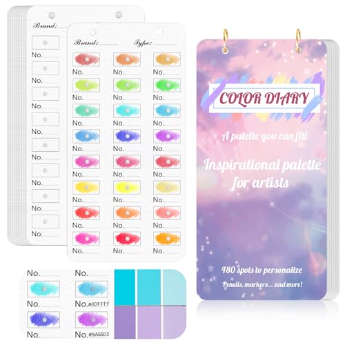
【Note】Compatible with different types of pens. Multiple layers using water-based pens may result in minor surface pilling.
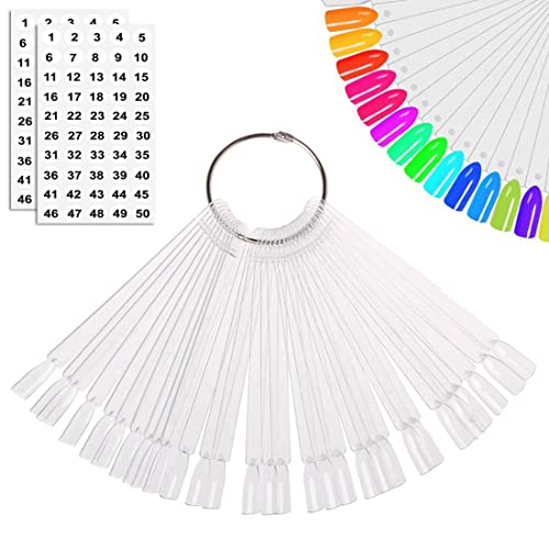
EASY TO ORGANIZE: With 50 pieces transparent sector fan boards. with the split ring, You can use to display the nail polish colors easily or take them off
Testing Colors in Different Lighting Conditions
Once color samples have been applied to walls, observe them under various lighting conditions before finalizing a choice. The same color can appear drastically different depending on whether it is viewed in natural daylight or under artificial lighting at night. For instance, a soft gray may look warm and inviting during the day but could take on a cooler tone under certain bulbs.
Check each sample in the morning, afternoon, and evening. Stand close to the sample, then step back and view it from the room entrance. A color may look beautiful up close but feel too dark or too intense when viewed across the room. Also look at the sample with lamps on, overhead lights on, and window coverings closed.
Testing colors in different rooms can yield surprising results. A shade that feels cozy in one space may feel heavy in another because of differences in size, ceiling height, wall direction, and light exposure. A color that works in a sunny living room may look dull in a shaded hallway. This is why it is safer to test each room separately rather than assuming one color will behave the same everywhere.
Allow painted samples to dry completely before judging them. Wet paint can look glossier, darker, or uneven. If possible, live with the samples for a few days. A little patience can prevent the much bigger frustration of repainting an entire room.
Warning: If your home was built before 1978, avoid sanding or disturbing old painted surfaces without checking for lead-based paint and following proper safety guidance.
Choosing the Right Finish for Each Room

[Amazon Products Picked for You]

Self-Priming formula - requires no sanding

PAINT + PRIMER IN ONE: Evolve’s paint-and-primer formula helps you get great coverage from the start, sealing your surface and reducing the extra work of multiple coats.

Ready to use, pre-mixed door and trim paint offers a fresh new look on interior or exterior metal, wood and fiberglass
Choosing the Right Finish for the Job
Paint finish, also called sheen, affects durability, washability, light reflection, and the final appearance of the color. Flat and matte finishes are excellent for hiding small wall imperfections because they reflect less light. They often work well in adult bedrooms, ceilings, formal dining rooms, and low-traffic spaces where frequent scrubbing is less likely.
Eggshell and satin finishes offer a balanced option for many rooms. They have a soft, low shine but are usually easier to clean than flat paint. These finishes are often used in living rooms, family rooms, bedrooms, and hallways. Satin can reflect more light than eggshell, so it may show surface flaws more clearly on uneven walls.
High-Traffic Areas Require Special Consideration
Semi-gloss or high-gloss finishes are ideal for areas that require frequent cleaning or extra durability against moisture, such as kitchens, bathrooms, laundry rooms, trim, doors, and cabinets. These finishes reflect light more effectively, which can help brighten smaller spaces. However, they may also highlight dents, bumps, brush marks, or imperfect drywall.
For kids’ rooms, mudrooms, and busy hallways, washable paint can be more practical than a delicate matte finish. The color may be beautiful, but the finish must match daily life. If you have pets, children, or high-touch walls, choose a finish that can handle cleaning without losing its look.
Functionality and Aesthetic Preferences
When selecting paint finishes, consider both function and style. A deep navy in a glossy finish can feel dramatic and polished, while the same navy in matte can feel softer and more modern. A pale color in satin may brighten a room, while a flat finish can make it feel calmer and more understated.
A well-chosen finish can elevate the overall design while ensuring that the paint withstands the demands of its environment. When in doubt, use lower-sheen finishes for walls in quiet spaces and higher-sheen finishes for trim, doors, cabinetry, and moisture-prone rooms.
Choosing Colors by Room Type
Each room has a different purpose, so each room may need a different color strategy. Bedrooms usually benefit from restful shades such as soft blue, warm white, muted green, beige, or gentle gray. These colors can create a calm backdrop for sleep and relaxation. If you prefer a darker bedroom, deep green, charcoal, navy, or warm brown can feel cozy when balanced with good lighting and lighter bedding.
Living rooms often need flexibility because they support conversation, relaxing, entertaining, and family time. Warm neutrals, soft whites, greige, taupe, muted green, and gentle blue can work well. If your living room has strong natural light, you may be able to use deeper or richer colors without making the space feel closed in.
Kitchens and dining rooms can handle more energy. Cream, white, soft green, blue, terracotta, muted yellow, and warm gray can all work depending on your cabinets and countertops. In bathrooms, lighter colors can make the room feel clean and open, while richer colors can create a spa-like or dramatic effect.
Home offices need colors that support focus. Some people work best with calming colors like blue or green, while others feel more motivated around warm neutrals or earthy tones. Avoid choosing a color only because it is trendy. Pick the color that helps you use the room comfortably.
Considering Room Size, Ceiling Height, and Architecture
Paint can change how a room feels, even though it cannot change the room’s actual size. Light colors can make a small room feel brighter and more open, especially when paired with good lighting and simple decor. Dark colors can make a room feel cozy, dramatic, or intimate. They do not always make a room feel smaller if the lighting and furniture are well balanced.
Ceiling height also matters. A white or light ceiling can make a room feel taller and airier. A darker ceiling can make a large room feel more intimate. Painting the ceiling the same color as the walls can create a wrapped, seamless look, especially in bedrooms, powder rooms, and spaces with unusual angles.
Architecture should guide your color choices as well. Traditional homes may suit classic whites, creams, historic greens, muted blues, and warm neutrals. Modern homes often work well with crisp whites, charcoal, black accents, soft gray, and clean earthy tones. Farmhouse, cottage, coastal, and vintage homes may need softer, warmer, or more textured color palettes.
Common Paint Color Mistakes to Avoid
One common mistake is choosing a color from a phone screen or online photo alone. Screens vary widely, and professional room photos are often edited or taken under ideal lighting. Use online inspiration to narrow your style, but always test the actual paint in your home.
Another mistake is ignoring trim color. Wall paint can look very different beside bright white, cream, stained wood, black, or gray trim. If your trim has a warm undertone, a cool wall color may make it look yellow. If your trim is a cool white, a creamy wall color may look dingy beside it.
Choosing too many unrelated colors can also make a home feel busy. Variety is good, but the colors should share a visual connection. Repeat undertones, saturation, or accent colors to keep the whole home feeling calm and intentional.
Finally, do not skip primer when the wall condition or color change requires it. Dark-to-light changes, glossy surfaces, stains, patched drywall, and strong previous colors may need primer for better coverage and a smoother final result.
Seeking Professional Advice
While many homeowners feel confident making design choices independently, seeking professional advice can provide valuable insights. Interior designers and color consultants understand color theory, lighting, undertones, finishes, and design principles. They can help you narrow choices more quickly and avoid expensive mistakes.
A professional can also offer tailored recommendations based on your home’s layout, fixed finishes, furniture, and natural light. This can be especially helpful if you are painting several rooms, preparing a home for sale, updating an open floor plan, or coordinating paint with new flooring, cabinets, or countertops.
Professionals often have access to larger color decks, visualization tools, and experience with how popular colors behave in real homes. A short consultation can save time and reduce stress by helping you choose a palette with more confidence. You can still make the final decision, but you will make it with better information.
[Amazon Products Picked for You]


Premium Human Hair Construction: Each package contains 30 hair pieces made from 100% remy human hair that is natural, smooth, and flexible with thick wefts, can be dyed at will and bleached many times for multiple uses
Considering the Overall Mood and Ambiance
Ultimately, the choice of color should align with the desired mood and ambiance of each room within your home. Different spaces serve different functions, so their color schemes should reflect how you use them. Vibrant hues may energize a home office, craft room, workout space, or playroom. Softer tones may work better in bedrooms, reading nooks, bathrooms, and living rooms where comfort matters.
Personal preference plays a major role in determining what feels comfortable and inviting. Some people love bold colors that express creativity and personality. Others prefer muted tones that feel calm, clean, and flexible. Neither approach is wrong. A beautiful home should reflect the people who live in it.
Before choosing a final color, ask yourself how you want the room to feel in daily life. Do you want it to feel bright, cozy, elegant, playful, relaxed, dramatic, or fresh? Once you define the mood, the color decision becomes easier. You are no longer choosing from thousands of shades; you are choosing the shade that supports the experience you want.
If you’re looking to spruce up your home with a fresh coat of paint, you may also be interested in finding the perfect cookie cutters for your kids to enjoy baking with. Check out this article on the 5 Best Cookie Cutters for Kids to add some fun to your kitchen activities.
Related Guides
Frequently Asked Questions
What factors should I consider when choosing paint colors for my home?
Consider the natural light in the room, the mood you want to create, the existing furniture and decor, the flooring, the trim color, the room size, and the overall aesthetic you want to achieve. You should also check undertones and choose a finish that fits the room’s traffic and cleaning needs.
How can I test paint colors before committing to a full room?
Use sample-sized containers, large painted boards, or peel-and-stick paint swatches. Test each color on more than one wall, then view it in morning light, afternoon light, evening light, and under your regular bulbs before making a final choice.
What are some popular paint color trends for homes?
Neutral colors like greige, warm white, soft blue, and muted green remain popular because they feel calm and flexible. Bold accent colors like deep navy, emerald green, terracotta, charcoal, and mustard yellow can also add personality when used thoughtfully.
Should I consider the architecture of my home when choosing paint colors?
Yes. The architectural style of your home can influence which colors look most natural. A Victorian home may suit traditional or historic shades, while a modern home may look better with crisp neutrals, clean contrast, and a more minimal palette.
Are there any rules for coordinating paint colors throughout different rooms in the home?
There are no strict rules, but it helps to create a cohesive palette. Use related undertones, repeat trim colors, and choose shades that flow naturally from one room to the next. This is especially important in open floor plans and connected spaces.
What paint finish is best for high-traffic rooms?
Eggshell, satin, and semi-gloss finishes usually work better in high-traffic areas than flat finishes because they are easier to clean. Use satin or semi-gloss for kitchens, bathrooms, hallways, trim, and rooms where walls may need frequent wiping.
Why does my paint color look different after it dries?
Paint can look darker, lighter, flatter, or less glossy after it dries. Lighting, wall texture, number of coats, primer, and sheen all affect the final look. Always let samples dry completely before judging the color.
Sources
- U.S. Department of Energy — lighting choices and how bulbs affect the way a space looks and functions.
- U.S. Environmental Protection Agency — lead safety guidance for older homes and painted surfaces.
- National Institute of Standards and Technology — color and appearance concepts that support accurate color evaluation.