Color is not merely a visual phenomenon; it is a powerful psychological tool that influences emotions, behaviors, and perceptions. The psychology of color delves into how different hues can evoke specific feelings and reactions. For instance, warm colors like red, orange, and yellow are often associated with energy, warmth, and excitement.
These colors can stimulate conversation and create a lively atmosphere, making them ideal for social spaces such as living rooms or dining areas. Conversely, cool colors like blue, green, and purple tend to promote calmness and tranquility. These shades are frequently used in bedrooms or bathrooms to foster relaxation and serenity.
Moreover, cultural context plays a significant role in color perception. For example, while white is often associated with purity and peace in Western cultures, it can symbolize mourning in some Eastern traditions. This cultural variance underscores the importance of understanding the audience when selecting colors for a space.
Additionally, personal experiences and preferences can shape an individual’s emotional response to color. A person may feel nostalgic when seeing a particular shade of blue reminiscent of their childhood home, while another may find it cold and uninviting. Therefore, when choosing colors for a space, it is essential to consider not only the psychological implications but also the personal and cultural associations that may influence how the colors are perceived.
Key Takeaways
- Different colors can evoke different emotions and moods, so it’s important to understand the psychology of color before choosing a color scheme for a room.
- The lighting in each room can affect the way colors appear, so it’s important to consider the natural and artificial lighting when selecting paint colors.
- When choosing paint colors, it’s important to harmonize with the existing furniture and decor in the room to create a cohesive and balanced look.
- Using color swatches and samples can help visualize how a color will look in a room and make it easier to compare different options.
- Testing colors in different lighting conditions, such as natural daylight and artificial evening light, can help ensure that the chosen color will look good in all situations.
Considering the Lighting in Each Room
Lighting is a critical factor that can dramatically alter the appearance of color in any given space. Natural light, artificial light, and the direction from which light enters a room all contribute to how colors are perceived. For instance, a room bathed in warm, natural sunlight can make colors appear more vibrant and lively, while fluorescent lighting may wash out those same colors, making them look dull or lifeless.
Understanding the type of lighting present in each room is essential for achieving the desired aesthetic. In addition to the type of lighting, the time of day can also affect how colors are viewed. Morning light tends to be cooler and more subdued, while afternoon light is warmer and more intense.
This variation means that a color that looks appealing in the morning may not have the same effect later in the day. Therefore, it is advisable to observe how colors change throughout the day in each room before making a final decision. By taking into account both natural and artificial lighting conditions, one can ensure that the chosen colors will maintain their intended impact regardless of the time or type of light present.
Harmonizing with Existing Furniture and Decor

When selecting colors for a room, it is crucial to consider the existing furniture and decor elements. A cohesive design scheme enhances the overall aesthetic and creates a sense of harmony within the space. For example, if a room features dark wood furniture, pairing it with lighter wall colors can create a striking contrast that highlights both elements.
Alternatively, if the furniture is upholstered in bold patterns or vibrant colors, opting for more neutral wall shades can help balance the visual weight and prevent the space from feeling overwhelming. Additionally, textures play an important role in how colors interact with one another. A matte finish on walls may absorb light differently than a glossy finish, affecting how colors are perceived in relation to furniture and decor.
It is also beneficial to consider the style of existing pieces; modern furniture may clash with traditional color palettes, while vintage decor might require more muted tones to complement its character. By thoughtfully harmonizing wall colors with existing furnishings and decor styles, one can create a cohesive environment that feels intentional and well-designed.
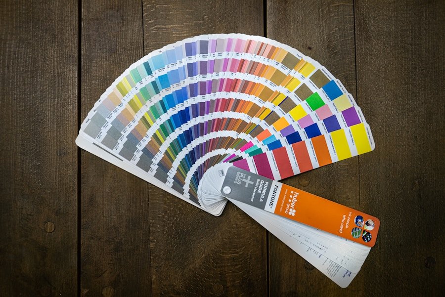
Using Color Swatches and Samples
| Color Swatch | RGB Value | Hex Code | CMYK Value |
|---|---|---|---|
| Red | 255, 0, 0 | #FF0000 | 0, 100, 100, 0 |
| Blue | 0, 0, 255 | #0000FF | 100, 100, 0, 0 |
| Green | 0, 255, 0 | #00FF00 | 100, 0, 100, 0 |
Before committing to a color for an entire room, utilizing color swatches and samples is an essential step in the decision-making process. Paint companies typically offer small samples that allow homeowners to test colors on their walls before making a purchase. This practice enables individuals to see how different shades look in their specific environment, taking into account factors such as lighting and surrounding decor.
It is advisable to apply swatches on multiple walls to observe how they interact with various angles of light throughout the day. Moreover, color swatches provide an opportunity to experiment with different combinations. By placing several swatches next to each other, one can visualize how different hues complement or contrast with one another.
This method is particularly useful when creating accent walls or selecting complementary colors for adjacent rooms. It allows for a more informed decision-making process that considers not only individual preferences but also how colors will work together within the broader context of the home.
Testing Colors in Different Lighting Conditions
Once color samples have been applied to walls, it is crucial to observe them under various lighting conditions before finalizing a choice. The same color can appear drastically different depending on whether it is viewed in natural daylight or under artificial lighting at night. For instance, a soft gray may look warm and inviting during the day but could take on a cooler tone under incandescent bulbs.
To ensure that the selected color maintains its appeal throughout different times of day, it is advisable to observe it during morning, afternoon, and evening hours. Additionally, testing colors in different rooms can yield surprising results. A shade that feels cozy in one space may feel oppressive in another due to variations in size, shape, and light exposure.
By taking the time to evaluate how colors behave under different conditions, homeowners can avoid potential regrets after painting has commenced. This thorough approach ensures that the final color choice aligns with both aesthetic desires and practical considerations.
Choosing the Right Finish for Each Room

Choosing the Right Finish for the Job
For instance, flat finishes are excellent for hiding imperfections on walls but may not be as washable as glossier options. This makes them suitable for low-traffic areas such as bedrooms or formal dining rooms where durability is less of a concern.
High-Traffic Areas Require Special Consideration
On the other hand, semi-gloss or high-gloss finishes are ideal for areas that require frequent cleaning or durability against moisture, such as kitchens and bathrooms. These finishes reflect light more effectively, which can enhance brightness in smaller spaces but may also highlight imperfections on walls.
Functionality and Aesthetic Preferences
Therefore, when selecting paint finishes, it is essential to consider both functionality and aesthetic preferences. A well-chosen finish can elevate the overall design while ensuring that the paint withstands the demands of its environment.
Seeking Professional Advice
While many homeowners feel confident making design choices independently, seeking professional advice can provide valuable insights that enhance the decision-making process. Interior designers and color consultants possess expertise in color theory and design principles that can help individuals navigate complex choices more effectively. They can offer tailored recommendations based on specific needs and preferences while considering factors such as lighting conditions and existing decor.
Moreover, professionals often have access to resources that may not be available to the average homeowner, including advanced color visualization tools and extensive knowledge of current trends. Collaborating with an expert can also save time and reduce stress by streamlining the selection process. Whether through consultations or full-service design projects, professional guidance can lead to more informed decisions that result in beautifully cohesive spaces.
Considering the Overall Mood and Ambiance
Ultimately, the choice of color should align with the desired mood and ambiance of each room within a home. Different spaces serve various functions; therefore, their color schemes should reflect their intended use. For example, vibrant hues may energize a home office or workout space where motivation is key, while softer tones might be more appropriate for relaxation areas like bedrooms or reading nooks.
Additionally, personal preferences play a significant role in determining what feels comfortable and inviting within a space. Some individuals may gravitate toward bold colors that express creativity and passion, while others may prefer muted tones that evoke calmness and stability. By carefully considering both functional needs and emotional responses to color choices, homeowners can create environments that not only look appealing but also resonate deeply with their inhabitants’ lifestyles and personalities.
If you’re looking to spruce up your home with a fresh coat of paint, you may also be interested in finding the perfect cookie cutters for your kids to enjoy baking with. Check out this article on the 5 Best Cookie Cutters for Kids to add some fun to your kitchen activities.
FAQs
What factors should I consider when choosing paint colors for my home?
Consider the natural light in the room, the mood you want to create, the existing furniture and decor, and the overall aesthetic you want to achieve.
How can I test paint colors before committing to a full room?
Many paint companies offer sample-sized containers of paint that you can use to test colors on a small section of the wall. You can also use peel-and-stick paint swatches or digital visualization tools.
What are some popular paint color trends for homes?
Neutral colors like greige, soft blues, and muted greens are popular choices for creating a calming and timeless look. Bold accent colors like deep navy, emerald green, and mustard yellow are also trending for adding pops of color.
Should I consider the architecture of my home when choosing paint colors?
Yes, the architectural style of your home can influence the best paint colors to use. For example, a Victorian home may look best with traditional, historic colors, while a modern home may suit more contemporary, minimalist colors.
Are there any rules for coordinating paint colors throughout different rooms in the home?
While there are no strict rules, it’s generally a good idea to create a cohesive color palette by considering the flow between rooms and using complementary or harmonious colors.